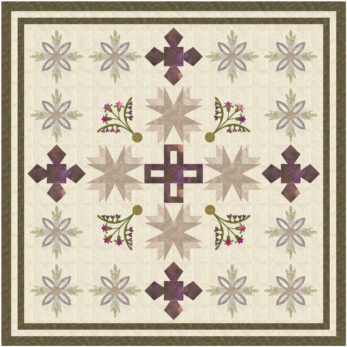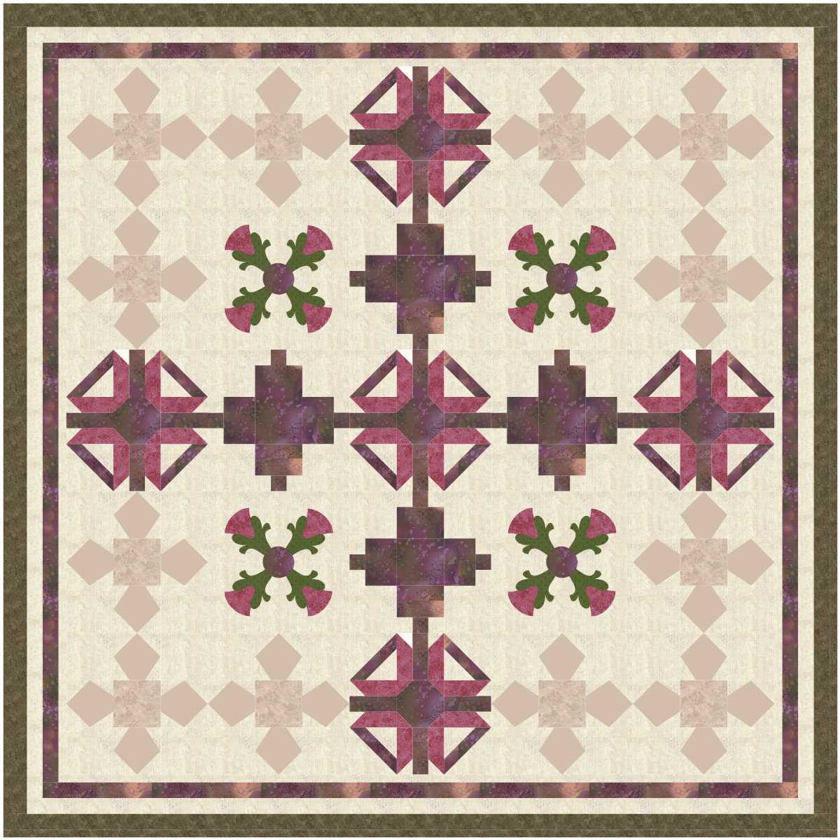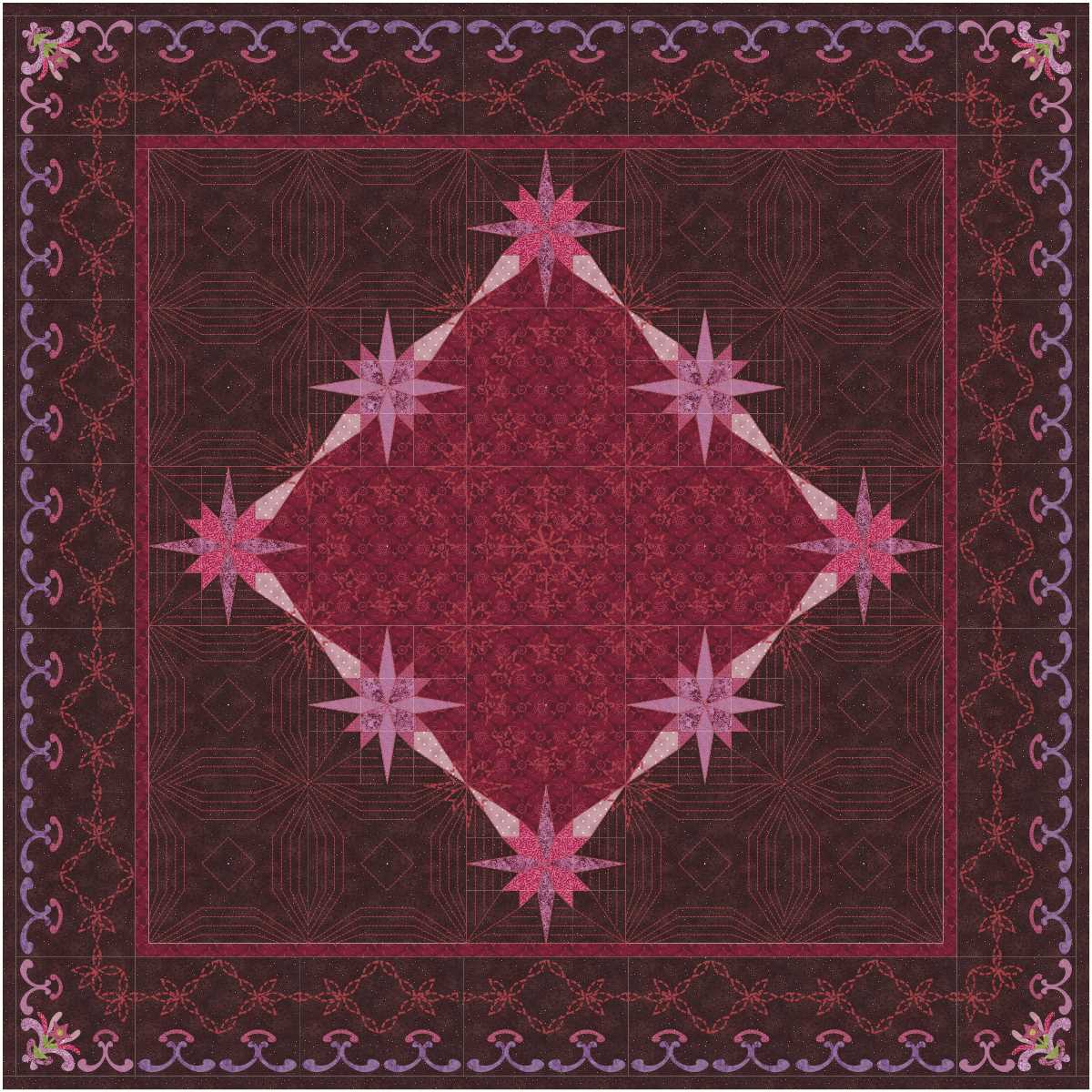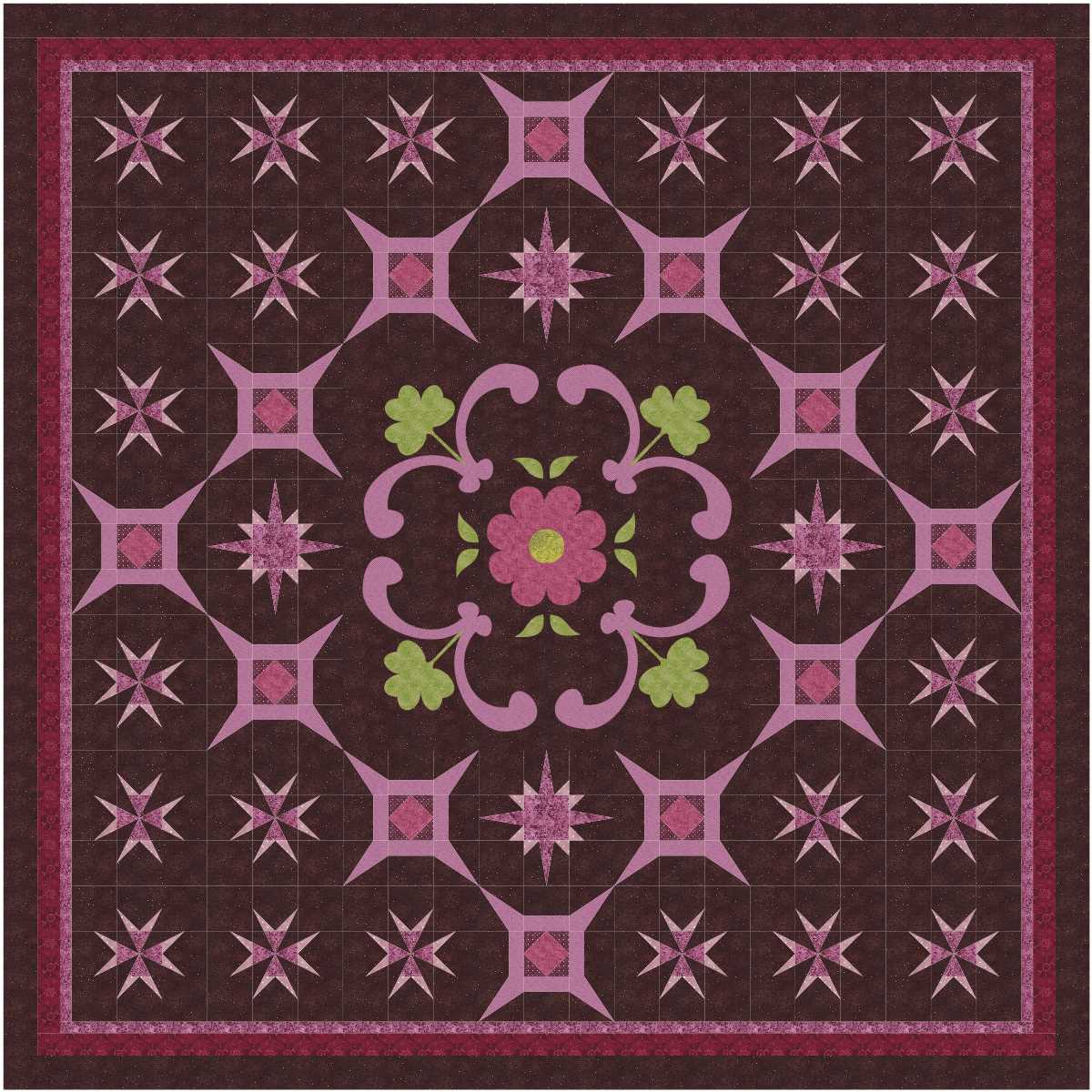
I like the contrasts in this project file … the pale pieced blocks in the corners calm down what could be a rather busy looking design.

In the second design I like the way the contrast background in the centre square creeps outside the square.
read more


